
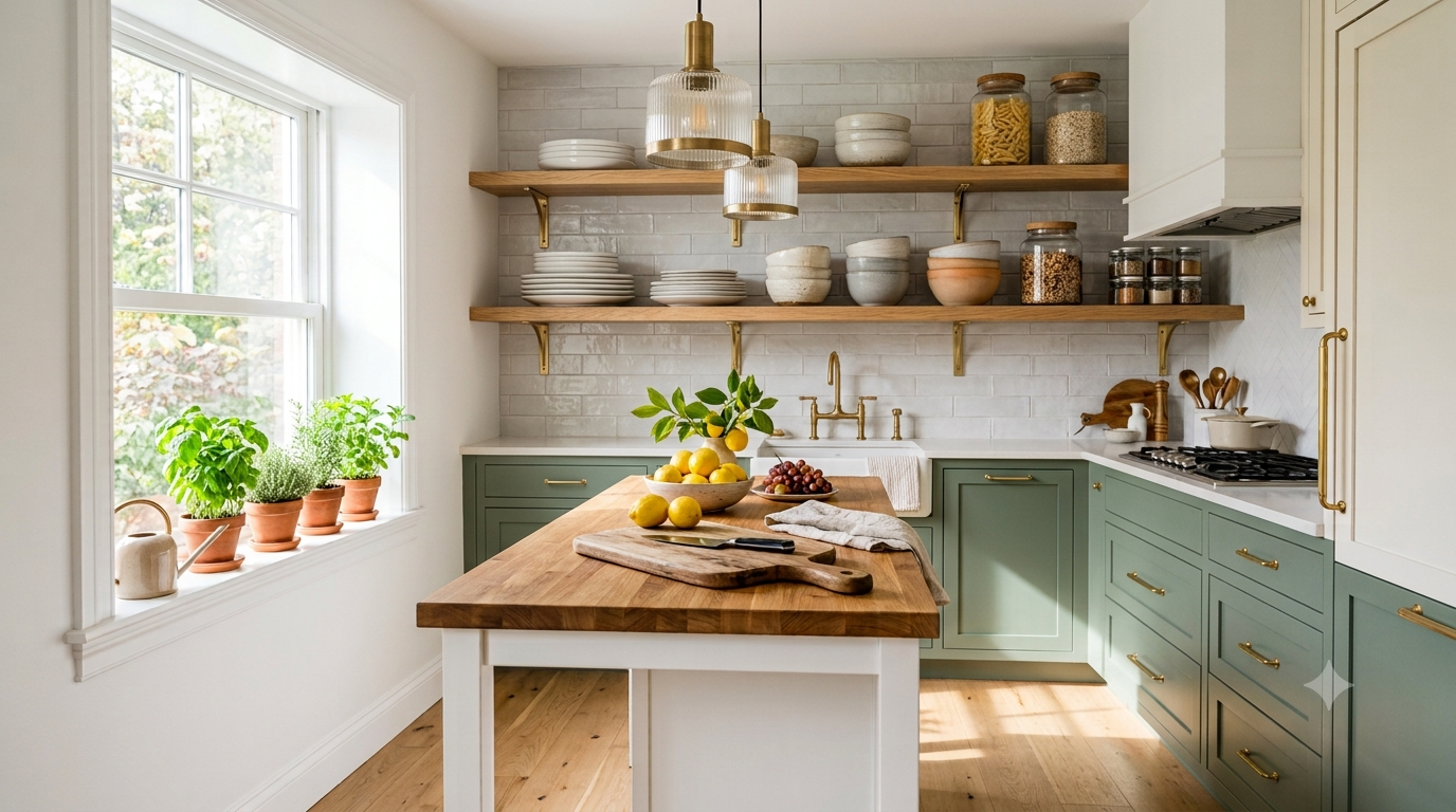
I Never Thought Two Cabinet Colors Could Make Such a Difference
When we first talked about updating our kitchen, replacing the cabinets wasn’t even on the list.
They were solid, well-built, and perfectly functional. The problem wasn’t quality—it was personality. Everything was the same shade of white. The room felt clean, but it also felt flat. Nothing caught your eye, and despite having plenty of natural light, the kitchen somehow lacked warmth.
One weekend, while browsing design inspiration online, I noticed something I hadn’t paid much attention to before.
Almost every kitchen that made me stop scrolling had one thing in common.
The cabinets weren’t all the same color.
Some paired warm white upper cabinets with deep navy lowers. Others combined natural oak with soft sage green. A few mixed creamy beige with charcoal gray, creating kitchens that felt sophisticated without trying too hard.
At first, I thought it was just another passing trend.
But the more kitchens I explored, the more I realized two-tone cabinetry wasn’t about following fashion. It was about creating balance.
Instead of making the kitchen feel busy, the contrasting colors added depth, highlighted architectural details, and gave the room a custom-designed appearance.
That single design decision completely changed how I looked at kitchen renovations.
If you’re planning a refresh in 2026, two-tone cabinets might be the simplest way to make your kitchen feel brand new—without replacing everything.
Why Two-Tone Cabinets Are Everywhere in 2026
Kitchen trends have shifted noticeably over the last few years.
There was a time when perfectly matching cabinets were considered the safest choice. Every door, drawer, and island wore the same finish from floor to ceiling.
Today, homeowners are looking for kitchens that feel more personal.
Instead of creating a space that resembles a showroom, they’re designing kitchens with warmth, texture, and character. Two-tone cabinetry achieves exactly that.
By using different colors or materials for upper and lower cabinets, designers create visual layers that make the room feel larger and more inviting.
Lighter colors naturally draw the eye upward, making ceilings appear higher, while darker lower cabinets anchor the room and hide everyday scuffs remarkably well.
The result feels balanced rather than dramatic.
Perhaps that’s why the trend has continued to grow instead of fading away.
The Secret Isn’t Choosing Bold Colors
One thing surprised me while researching hundreds of real kitchens.
The most beautiful examples weren’t necessarily the boldest.
In fact, many used subtle contrasts instead of dramatic ones.
Soft ivory paired with warm oak.
Greige combined with creamy white.
Muted olive alongside natural wood.
These combinations felt timeless because they weren’t trying to impress anyone.
They simply worked.
That’s an important lesson if you’re considering repainting your cabinets.
Instead of asking, “What’s the trendiest color?”
Ask yourself, “Which colors will still make me smile every morning five years from now?”
Timeless kitchens are usually built around that question.
White Upper Cabinets Continue to Be the Safest Choice
If there’s one combination designers consistently recommend, it’s keeping the upper cabinets light.
There’s a practical reason for this.
Upper cabinets occupy your direct line of sight.
When they’re painted in bright whites, warm creams, or soft beige tones, they reflect natural light around the room.
The kitchen instantly feels more spacious.
This is especially helpful in apartments and smaller homes where every bit of brightness matters.
Even if you choose a dramatic color below, light upper cabinets keep the room from feeling visually heavy.
It’s one of the simplest design tricks—and one of the most effective.
Dark Lower Cabinets Add More Than Just Contrast
When I first saw black lower cabinets online, I worried they’d make a kitchen feel smaller.
The opposite often happens.
Dark navy, charcoal, forest green, and rich walnut tones create a visual foundation that grounds the entire room.
They also happen to be far more forgiving.
Minor shoe marks.
Pet scratches.
Small scuffs from moving stools.
Everyday wear is much less noticeable than on bright white cabinets.
That’s one reason busy families are embracing darker lower cabinetry in 2026.
It isn’t only about style.
It’s about practicality.
Natural Wood Is Making a Huge Comeback
One of my favorite trends this year isn’t a paint color at all.
It’s wood.
For a while, painted kitchens dominated nearly every renovation project.
Now, homeowners are rediscovering the warmth that natural materials bring.
Light oak lower cabinets paired with creamy white uppers create a kitchen that feels relaxed and inviting.
Walnut islands introduce richness without making the room feel dark.
Even subtle wood grain adds texture that paint simply can’t replicate.
What’s especially appealing is that natural wood works with almost every design style.
Modern.
Scandinavian.
Farmhouse.
Japandi.
Transitional.
Instead of chasing trends, wood creates a timeless foundation that evolves beautifully over the years.
My Favorite Two-Tone Color Combinations for 2026
Some color pairings stand out because they feel effortlessly balanced.
Warm white and natural oak create a calm, airy atmosphere that works beautifully in both modern and traditional homes.
Soft sage green with creamy beige introduces gentle color while remaining surprisingly neutral.
Deep navy paired with crisp white delivers classic elegance that’s unlikely to feel dated anytime soon.
Greige and charcoal create subtle sophistication for homeowners who prefer understated interiors.
If you’re looking for something slightly warmer, dusty blue combined with light maple brings a relaxed coastal feel without becoming overly themed.
The best combination isn’t necessarily the boldest.
It’s the one that complements your flooring, countertops, and the amount of natural light your kitchen receives.
Test Colors Before You Commit
This may sound obvious, but it’s probably the most valuable lesson I learned.
Paint behaves differently throughout the day.
A color that looks soft and warm in the morning can appear much cooler under evening lighting.
Before making a final decision, paint large sample boards and place them around the kitchen.
Look at them beside your backsplash.
Your countertops.
Your flooring.
Even your cabinet hardware.
Those surrounding materials influence color far more than most people realize.
Spending a few extra days testing samples is much easier than repainting an entire kitchen because the shade looked different once everything was finished.
Your Kitchen Island Doesn’t Have to Match the Rest of the Cabinets
One design choice that completely changed my perspective was realizing the island doesn’t have to follow the same color palette as the perimeter cabinets.
For years, matching everything felt like the safest option. But as I explored more real homes—not just magazine spreads—I noticed that the most memorable kitchens often treated the island as its own focal point.
Imagine warm white upper cabinets, soft greige lower cabinets, and a deep forest green island with a butcher-block countertop.
Or creamy white cabinetry paired with a walnut island that instantly brings warmth into the room.
These combinations add personality without making the kitchen feel overwhelming.
If your budget only allows for painting one section, updating the island can deliver a dramatic transformation at a fraction of the cost of repainting every cabinet.
Don’t Overlook Cabinet Hardware
When people talk about two-tone kitchens, paint colors usually get all the attention.
But cabinet hardware quietly ties the entire design together.
I learned this after swapping out old brushed nickel handles for warm brass pulls.
The difference was remarkable.
Suddenly, the two cabinet colors felt intentional rather than disconnected.
In 2026, brushed brass continues to be one of the most popular choices because it complements warm whites, sage greens, navy blues, natural oak, and even charcoal finishes.
Matte black hardware creates a more contemporary look, especially when paired with white and wood combinations.
If your kitchen leans traditional, antique bronze or satin nickel can provide a timeless finish that ages gracefully.
Sometimes the smallest details make the biggest visual impact.
Matte or Satin? The Finish Matters More Than You Think
Choosing the right paint finish is just as important as choosing the right color.
Many homeowners automatically reach for high-gloss paint because it seems easier to clean.
The reality is a little more complicated.
Glossy cabinets tend to highlight fingerprints, scratches, and uneven surfaces.
For that reason, many designers now prefer matte or satin finishes.
A satin finish reflects just enough light to feel bright while remaining practical for everyday use.
Matte finishes create a softer, more sophisticated appearance and work especially well in modern kitchens with warm, earthy color palettes.
Whichever finish you choose, invest in a durable paint designed specifically for cabinetry. It will hold up much better against daily cooking, cleaning, and family life.
Don’t Forget About the Rest of the Kitchen
One mistake I nearly made was focusing only on cabinet colors.
A kitchen is a collection of materials working together.
Countertops, backsplash tiles, flooring, lighting, and even bar stools influence how your cabinets look.
For example, warm white cabinets paired with cool gray countertops can sometimes feel disconnected.
Likewise, rich walnut cabinets often look best with warm-toned quartz or natural stone rather than stark white surfaces.
Before committing to paint, gather samples of every major finish in the room.
Lay them together on the countertop and step back.
Seeing everything side by side will help you create a balanced palette instead of choosing colors in isolation.
Common Mistakes to Avoid
The first mistake is choosing trendy colors without considering your home’s overall style.
That vibrant color you love on social media might feel overwhelming after a few months if it clashes with the rest of your interior.
Another common mistake is creating too much contrast.
A kitchen should feel cohesive, not divided into separate halves.
Instead of pairing extremely bright white with an almost-black shade, consider softer transitions like cream with olive green or greige with walnut.
Ignoring natural light is another issue.
North-facing kitchens often benefit from warmer tones, while bright south-facing spaces can comfortably handle cooler shades.
Finally, don’t rush the decision.
Paint samples are inexpensive.
Repainting an entire kitchen is not.
Take your time.
Live with your sample boards for several days before making a final choice.
Budget-Friendly Ways to Achieve the Look
One reason I recommend two-tone cabinetry is that it doesn’t always require a complete renovation.
If your cabinets are structurally sound, repainting them can dramatically change the room for a fraction of the cost of replacing everything.
You can also combine painted cabinets with natural wood shelves, replace outdated hardware, install under-cabinet lighting, or update the backsplash to create a fresh, cohesive look.
Even replacing just the cabinet doors while keeping the existing frames can provide a custom appearance without stretching your budget.
Small upgrades often deliver surprisingly big results.
Styling a Two-Tone Kitchen Without Overdoing It
Once the cabinets are finished, it’s tempting to add colorful accessories everywhere.
I made that mistake at first.
Bright tea towels.
Patterned canisters.
Decorative trays.
Colorful appliances.
Instead of enhancing the kitchen, everything competed for attention.
Eventually, I simplified the styling.
A wooden cutting board leaning against the backsplash.
A ceramic bowl filled with lemons.
Fresh herbs on the windowsill.
A linen hand towel.
These simple touches allowed the cabinets to remain the star of the room while still making the space feel warm and lived in.
Sometimes restraint creates the most beautiful result.
Is the Two-Tone Trend Here to Stay?
I genuinely believe it is.
Not because it’s fashionable, but because it’s practical.
Two-tone kitchens solve a common design challenge: they add interest without overwhelming the room.
Unlike highly specific trends that quickly date a home, thoughtful color combinations have a timeless quality.
The key is choosing colors you’ll enjoy living with rather than simply copying what’s currently popular online.
In many ways, the trend reflects a larger shift in home design.
People are creating homes that feel personal rather than perfect.
And that’s exactly why I think two-tone cabinetry will continue to evolve long after 2026.
Final Thoughts
Looking back, painting the cabinets two different colors was one of the most rewarding changes we made.
It didn’t require moving walls or replacing expensive cabinetry.
Yet the kitchen felt brighter, warmer, and far more custom than before.
What surprised me most wasn’t how different the room looked—it was how different it felt.
Friends lingered longer around the island.
Cooking became more enjoyable.
Even simple weekday dinners seemed a little more special.
That’s the beauty of thoughtful design.
Sometimes the biggest transformation doesn’t come from spending more money.
It comes from seeing the space with fresh eyes and making a few intentional choices that reflect how you actually live.
Key Takeaways
- Two-tone cabinets remain one of the strongest kitchen design trends in 2026.
- Light upper cabinets help small kitchens feel brighter and more spacious.
- Darker lower cabinets hide everyday wear while adding visual depth.
- Natural wood is making a major comeback as part of two-tone designs.
- Cabinet hardware plays a crucial role in tying different colors together.
- Always test paint samples under your kitchen’s natural and artificial lighting.
- Focus on timeless combinations that suit your home rather than short-lived trends.
Frequently Asked Questions
Are two-tone kitchen cabinets still in style in 2026?
Yes. Designers continue to embrace two-tone cabinetry because it creates depth, personality, and a more custom appearance while remaining timeless when done thoughtfully.
What are the most popular cabinet color combinations for 2026?
Warm white with natural oak, soft sage with cream, navy with white, greige with charcoal, and walnut paired with warm neutral paint colors are among the most popular combinations.
Should upper or lower cabinets be darker?
Most designers recommend lighter upper cabinets and darker lower cabinets. This makes the kitchen feel more open while helping conceal everyday wear on lower cabinetry.
Can I have a different color on my kitchen island?
Absolutely. A contrasting island is one of the easiest ways to add character and create a focal point without overwhelming the space.
Will two-tone cabinets go out of style?
While specific colors may evolve, the concept of mixing complementary tones has become a timeless design approach because it prioritizes balance and personalization over trends.
Editorial Disclaimer
This article is provided for informational and inspirational purposes only. Paint colors, materials, and renovation outcomes may vary depending on your home’s lighting, layout, and existing finishes. Always test paint samples before making permanent changes and consult a qualified professional when undertaking major renovations. PrimeBuzzHub may display advertisements through Google AdSense and other trusted advertising partners. Advertising does not influence our editorial recommendations or opinions.